
Project Overview
Client- Marx Memorial Library and Workers' School
Industry- Education, Arts, Culture
Timeline- 14 weeks
Collaborator- Sakthi AK (Visual Designer)
My Role- Conceptualization, Designing, Prototyping, Coding, Testing
Challenge
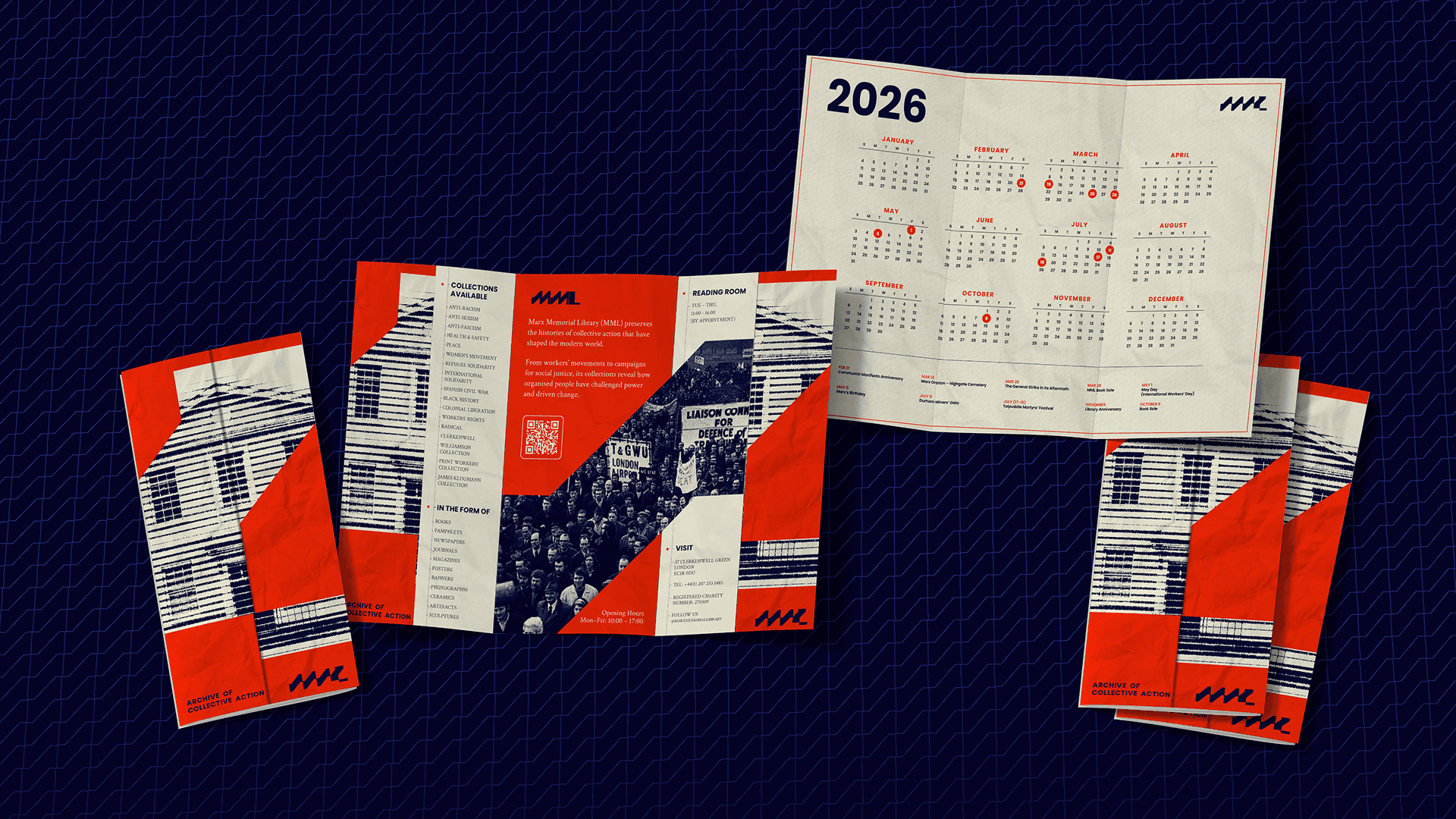
The Marx Memorial Library holds over 60,000 books, pamphlets and periodicals on socialist movements and ideologies. The Library itself is a historic building rooted in Clerkenwell’s radical tradition, even housing Marx and Lenin during their exile.
But they face two major challenges. One, lack of organization due to financial and infrastructural limitations, and restricted access to their materials due to fragility and copyright laws. Two, limited reception because of their narrow perception as a pilgrim spot for communists and Marx-Lenin followers, and a predominantly senior audience.
Approach
While the building's history is invaluable, the Institute has to reassert its position as a leading educational voice in the discussions on the future of this world and social change.The Institute needed an identity to activate engagement with both existing and new audiences in everything that it does. From research to education and activism.
What's in a name?
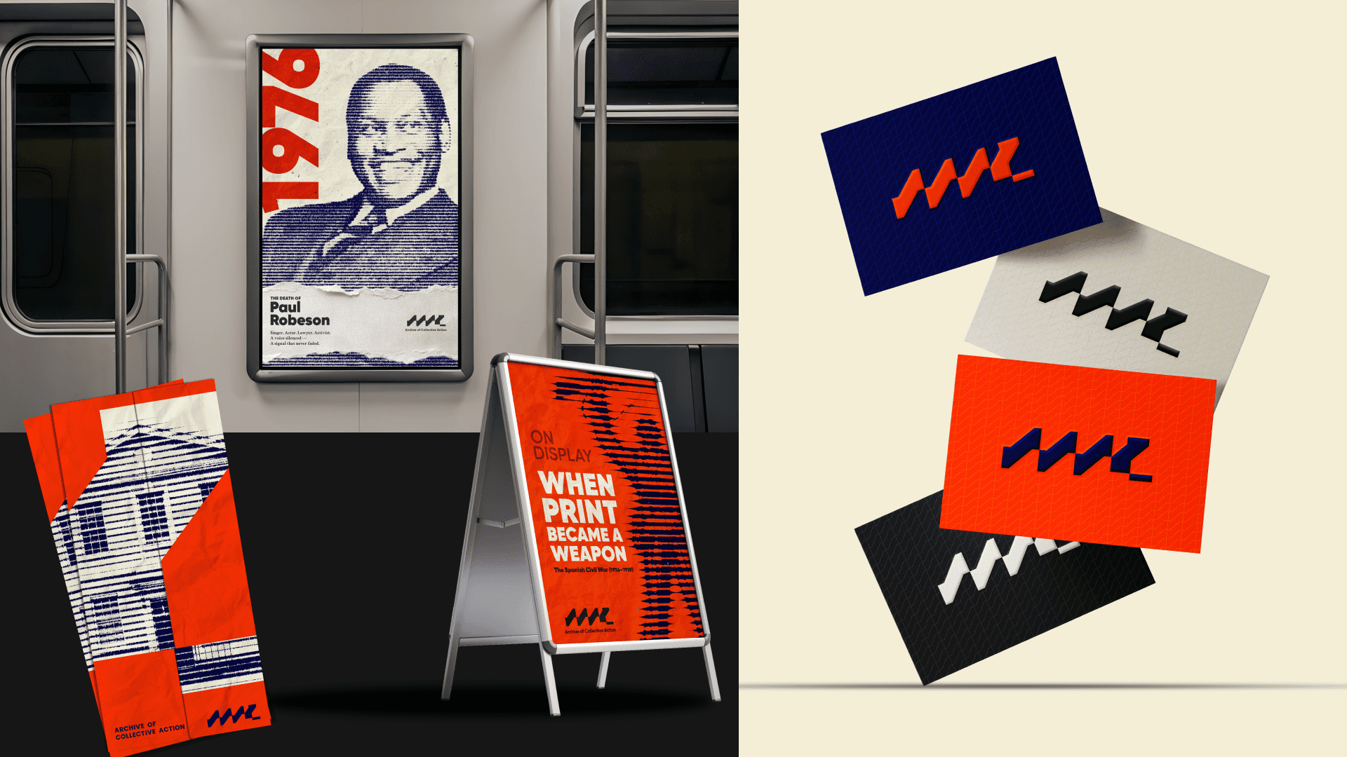
The Institute needed a symbol that made reference to the forward movement of society and the domino effect between social movements across the world. The symbol features an abstract blocky form of MML, representing the energy of the domino effect, while also paying homage to the printing press once homed in the building.
We also conceptually defined the Institute as a radio, a tool once critical in passing the message along. This analogy is used at points throughout our designing process to urge visitors' to interact and engage with the connect. The brand palette has a broad and energetic combination of colours, to reflect the energy of the collections and invite audiences of all backgrounds and origins to participate and learn.
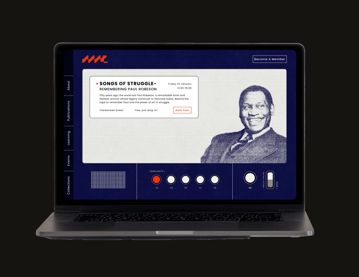
Turning a passive observer to an active learner
We reinvented the visitor experience by transforming the traditional audio guide with "The Tuner", a web app for every guest upon entry. Visitor's can tune into various channels and listen to an introductory snippet of the many collections archived at MML, voice by UK's lead researchers in the field. This allowed visitors' to quickly find a theme resonated with, instead of being overwhelmed by the many options.
The Tuner also offers a "Live" channel that can support an audio guide to any exhibitions happening at the time. The scanner feature of the app helps bridge the displayed materials to the vast collection online. Visitors can save any material they find interesting and even look for similar materials from the collection. Finally becoming a tool that encourages deeper participation by visitors.


First impressions
Each version of the radio on digital interfaces was designed to resemble an actual radio inspired by the work of Dieter Rams. Designed the landing page with the intention to encourage interaction from visitors. It provided the perfect spot the key events, important information like time, date and location along with a call to action, helping users stay informed and act quickly.
The "radio" here is also taken as an opportunity to display some of MML's audio archives, making it a complete audio, visual experience.
The treasure chest of knowledge
With the amount of content and the detailed data available for each material, it became essential to reduce the effort required to access it. Instead of making users tap through multiple tabs, the experience was designed around quick, intuitive gestures. A simple tap reveals key information and action instantly, from viewing titles and publication details to finding more details about its origin and location on site, and even adding the materials to your reading list.

These gestures make exploration feel natural and fluid, allowing users to browse the content the way they would in the real world. This approach not only reduced navigation steps but also made researching online faster, smarter, and more engaging.


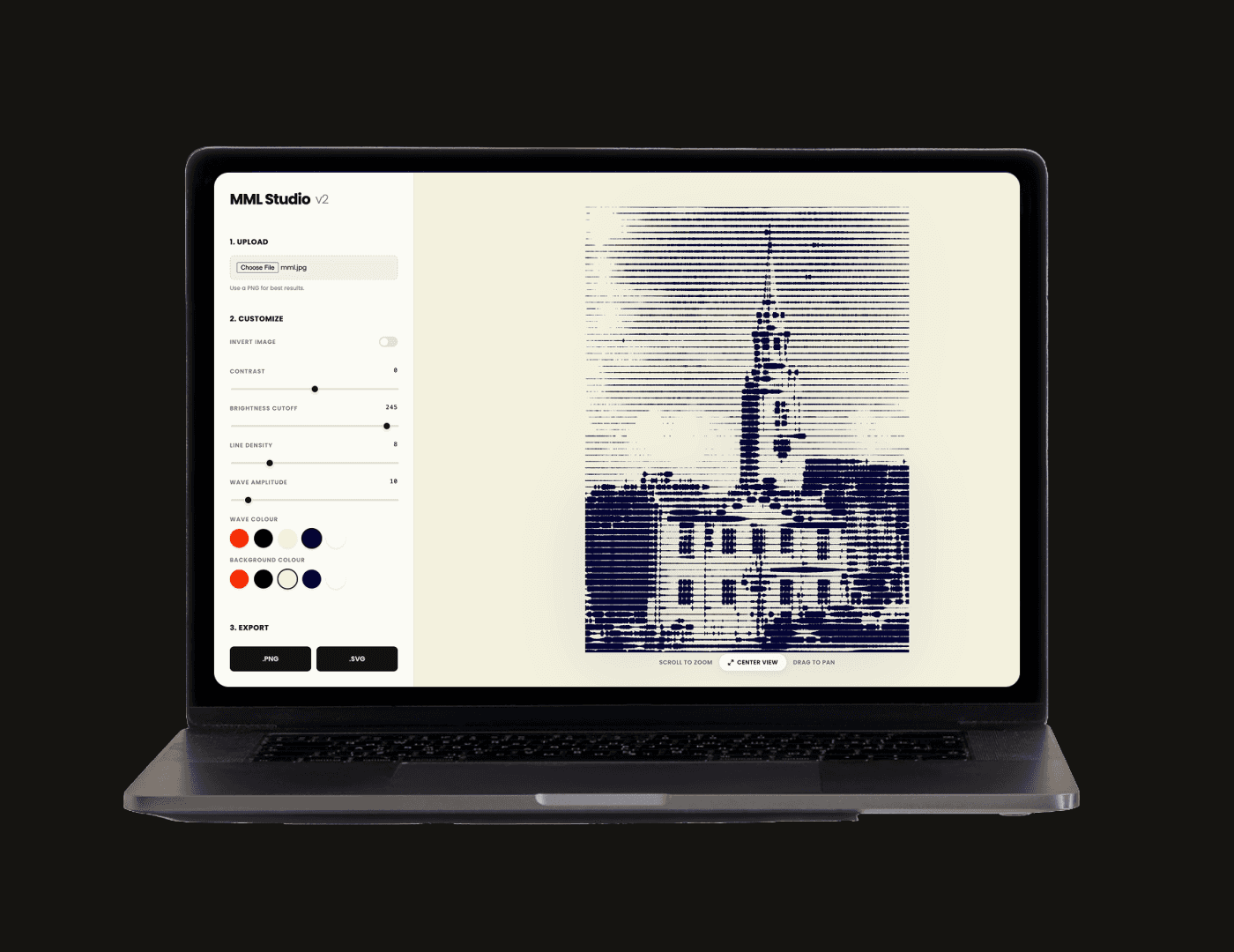
Generative Solution
Design and coded an image stylizer for the client to easily replicate the suggested visual style. This is crucial in maintaining the brand identity across media and platforms. The stylizer is very rudimentary, guiding even the most novice user through the process. Once, an image is uploaded, the user can play around with customizable setting to achieve the desired look. The traditional colour picker is swapped for a fixed palette of the brand colours, to avoid any deterrence.
Taking a moment to acknowledge the incredible collaboration behind this product. It wouldn’t have come together the way it did without Sakthi who brought his craft and care to every detail.
